Terminal Touch Screens Mockup
Overview:
Atlantis Hub project is an interactive data-driven display for a transportation hub based in San Juan islands. I was challenged to present information of departures and arrivals of planes, trains, and ferries in an accessible way for travelers.
Skills: Rapid Prototyping, Visual Design, Motion Design, UX Design
Project Duration: 4 weeks, 2019
Tools: Adobe XD
Type: Academic Project
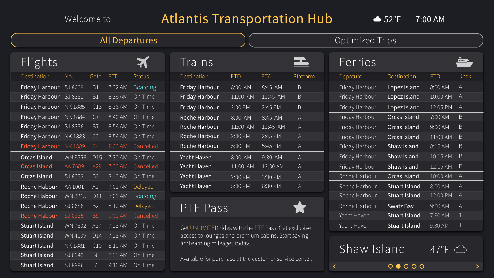
Final Design With Interaction

Final Visual Design
Design Process
Evaluating User Needs
Identifying User Needs And Cases
For this school project, we were given fictional information about both stakeholder and users. Before dive into design, I started with persona analysis. By identifying their goals and needs, I created a hierarchy of information based on how they are relevant to each user and the user cases.
Understanding the Data
Information Architecture
By given the large amount of transportation data, I categorized them by destinations and transportation methods. After visualizing all the relevant information, the patterns and relations I found led to the first sketch of data display.
Ideation: Hand Sketches
Sketches
Since this is a large display targeting towards the general public, I used sketches to explored some possible layouts for a highly readable and accessible environmental display.
Prototyping
In my first prototype, I incorporated the idea of optimized trips and the map of destinations to present the information within three hours for all destinations. Users would able to interact with the information by tapping to expand more detailed information for alternate trips. I used Source Sans Designed by Paul D. Hunt. From Adobe Originals for my type. To best guiding people to understand information and perform certain actions, I kept the design clear and consistent. The variation of strokes presented the data hierarchy to better guide users’ eyes for important information.
Black And White Wireframes
Visual Design: Color
After receiving feedback, I redesigned the interaction and structure of the display by adding some general departure information. In order to be more accessible to both users who need to plan their trips base on the information display and the users who only need a glimpse from distance to get the latest updates on gate information, the display contains all related information for same-day departures. By adding colors to the displays, users might be able to better identify areas they could interact with. I also utilized colors to present status of flights and draw their attention to the focal point.
Initial Visual Design
Interaction & Motion
After refined the design based on feedback I received, I started developing the user flow map for the interaction of tapping on the display screen. Users can switch between screens of all departure informations and different trip plans for all destinations. While finalizing the design for the display, I added some subtle motion design to indicate the change of states and make sure users are aware of the accuracy of data on the screen. Users will be able to tap on the screen to browse through trip information and switch back to general informations for same-day departures.